The right font can have a significant impact on your consumer. It can pique their interest and generate intrigue for your brand. The font that you use will cement the impression your consumers have about your brand. Each font evokes different emotions in the minds of the consumer, and you should choose the ones that closely represent your brand. For a luxury brand, it is especially critical that you choose the right font for your office stationery which will help your brand stand out from the crowd.


Choose the Right Font
Below are a few guidelines that will help you choose the right font for your luxury stationery.
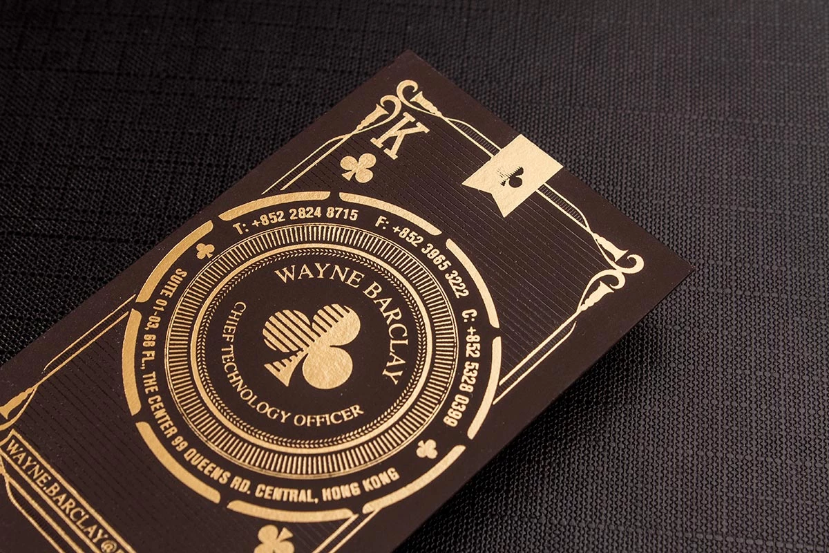
- Context is important: Where and how your stationery will be used is important while choosing the right font. For example, a business card should have a font that is clear and legible for its small size. Also, you need to make sure that your font resonates with the audience and occasion. For example, you can use cursive fonts for invitations to your company event but using them for your marketing communications is not always a good idea.
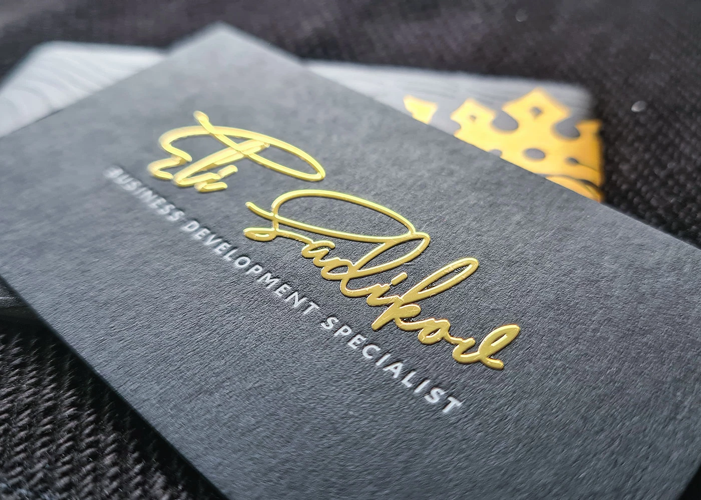
- Types of fonts: There are many fonts which you can use for your stationery that are divided into various font types. The main two types that you will use the most are “Serif” and “Sans Serif”. Typefaces that contain little feet or lines attached at the end of their letters are called “Serif” type fonts. For example, Times New Roman, Baskerville and Americana. “Sans Serif” translates to without serif and won’t have these feet. News Gothic, Verdana and Helvetica are examples of this type. You can use “Serif” typefaces to portray emotions of reliability, integrity and honesty. “Sans Serif” portrays modern, contemporary and stylish characteristics. Besides these two you also have “Script” and “Display” font types. “Script, as the name suggests, are cursive letters which connect with each other and are best used with invitations. “Display” type of fonts is mainly decorative and should rarely be used for luxury stationery.
- Font should be versatile: Your font should be versatile enough that it looks good even when it is represented in bold, italics, all caps or small caps. Doing so will open up design options while maintaining a cohesive look. Versatility will help your official documents pleasant to look at and easy to read through.
- Choosing more than one font: Choosing more than one font can get tricky. The chosen fonts should complement each other and at the same time not be too similar or too different from each other. Finding the fonts that go well together can be a bit challenging but can yield beautiful results. You need to ensure that the fonts that you choose shares certain qualities among them to ensure cohesion. You can also use different fonts for different parts of the documents. Example, the header can have a font that is different from the body text.


At Luxury Printing, New York, we understand that the sheer amount of font choice that is available can make things tricky for your clients. Why not let our designers come up with the right design and font for you? We use state of the art machinery and only the most luxurious of materials for printing your products. Connect with us today for all your luxury printing needs in New York.